What's With The Area Bands?
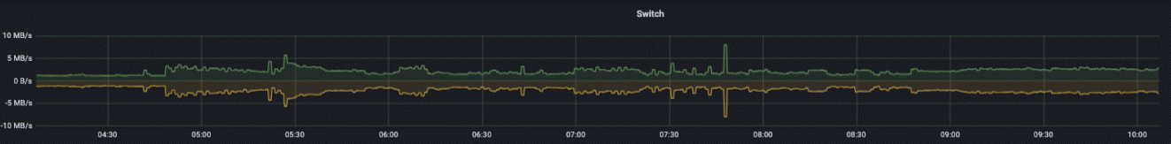
• Herbert WolversonOne of the first things many people notice when they launch LibreQoS Insight is that our bandwidth graphs look different. For example:
The lines are surrounded by an area. So what is this telling you?
Averages
Take a look at a traditional graph of throughput over time:
It’s pretty, but it’s also misleading. There’s several problems with this:
- There’s no indication what the sampling frequency is.
- If the graph has been scaled to fit a time period, you don’t know if there are any spikes or troughs in the data.
It’s quite common to sample at 5 minute or 1 minute intervals. Unless you are sampling at exactly once per second (for Megabits per second graphs) - you are only looking at an approximation. Even sampling at once per second can miss microbusts.
LibreQoS samples at 1 second intervals. Data is coalesced into larger time periods in LibreQoS Insight.
Why Averages Can Lie
Take these two series:
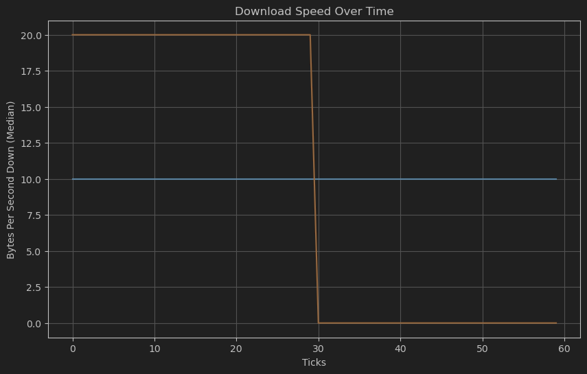
The first series contains the number 10, 60 times: the connection was perfectly steady at 10 Mbps.
The second series contains the number 20, 30 times - and then the number 0, 30 times: the connection was either fully utilized at 20 Mbps, or completely idle.
BOTH series have the same average: 10 Mbps. But they are very different in practice!
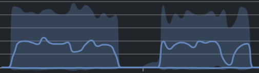
The Insight Solution: Error Bands
Whenever Insight coalesces data into larger time periods, it calculates the average, minimum, and maximum values for that period. The line on the graph is the average - but the area shows the minimum-to-maximum range.
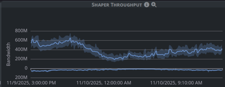
If you see a graph like this one:
The line shows what other systems would show you: the average throughput. With only the line, you’d miss that while the average is healthy — this connection is bumping up against its limits quite often! Maybe it’s time to sell the customer an upgrade.