LibreQoS Executive Dashboard
• Herbert WolversonWe’ve been working on something special for LibreQoS. The Insight heatmaps are popular - but feedback has indicated that sometimes they aren’t very clear - and it still requires a fair amount of effort to pinpoint problems.
A huge thank you to NLnet foundation for sponsoring this development.
Data Collection
In general, LibreQoS samples data at 1-second intervals. The dashboard has typically accumulated data client-side, and given you the last 5 minutes of data after you start watching. We’ve always done that to minimize RAM usage, with a view to letting LibreQoS run on relatively small servers. (Insight provides the same data over much larger timeframes, of up to 28 days - making this an acceptable compromise). A network overview that only shows accumulated data while you look at it wouldn’t be very useful. But we needed to balance:
- Keeping RAM usage small, ideally reclaiming memory freed by other optimizations.
- Displaying enough information to be useful.
- Keeping CPU usage for summarizing data reasonable.
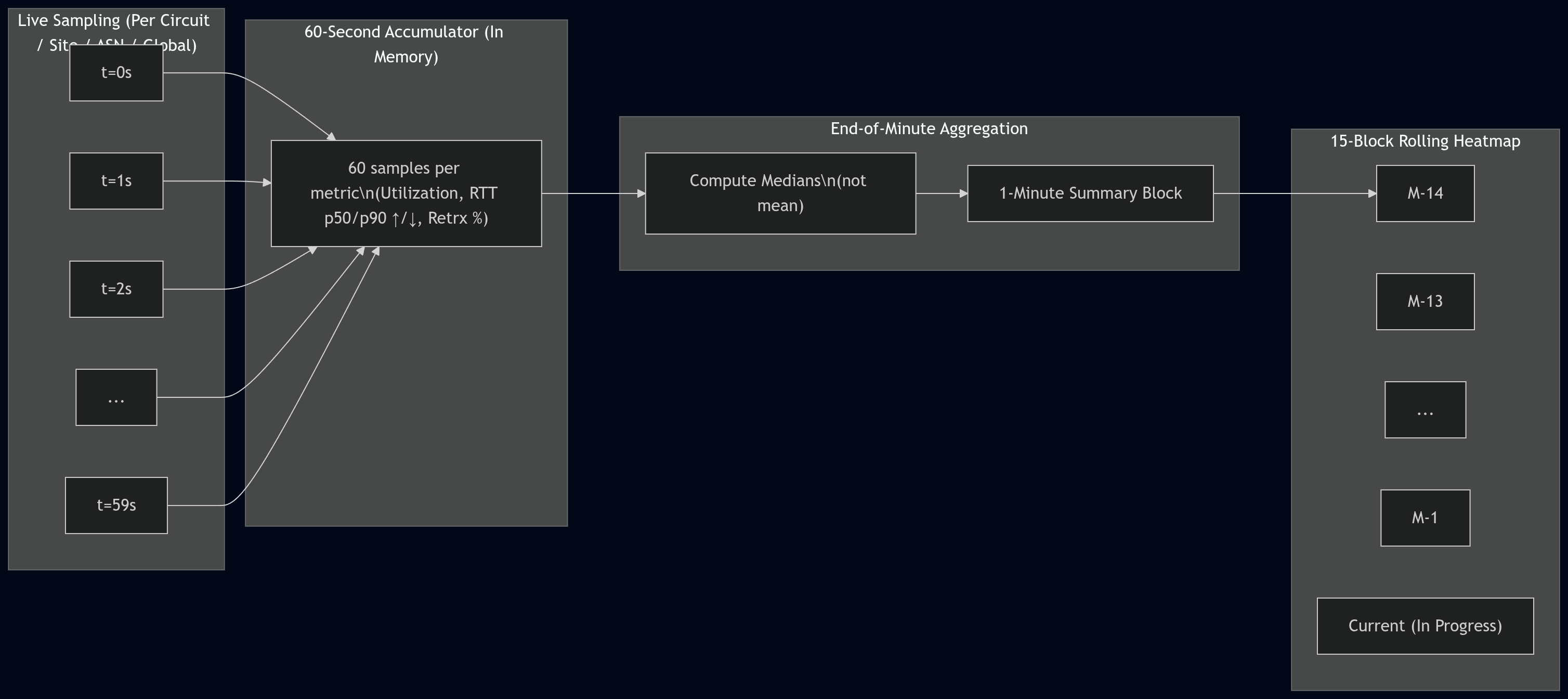
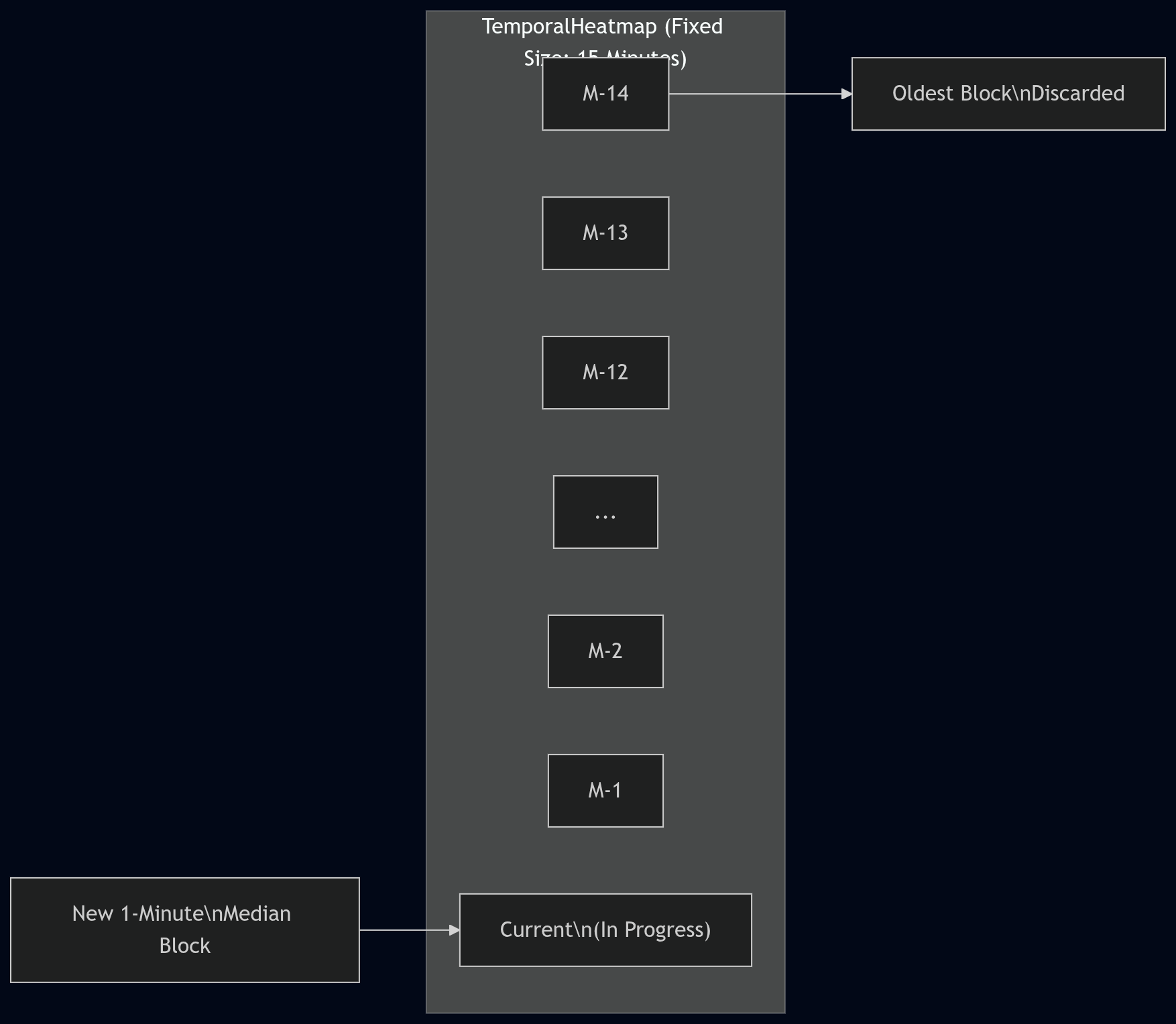
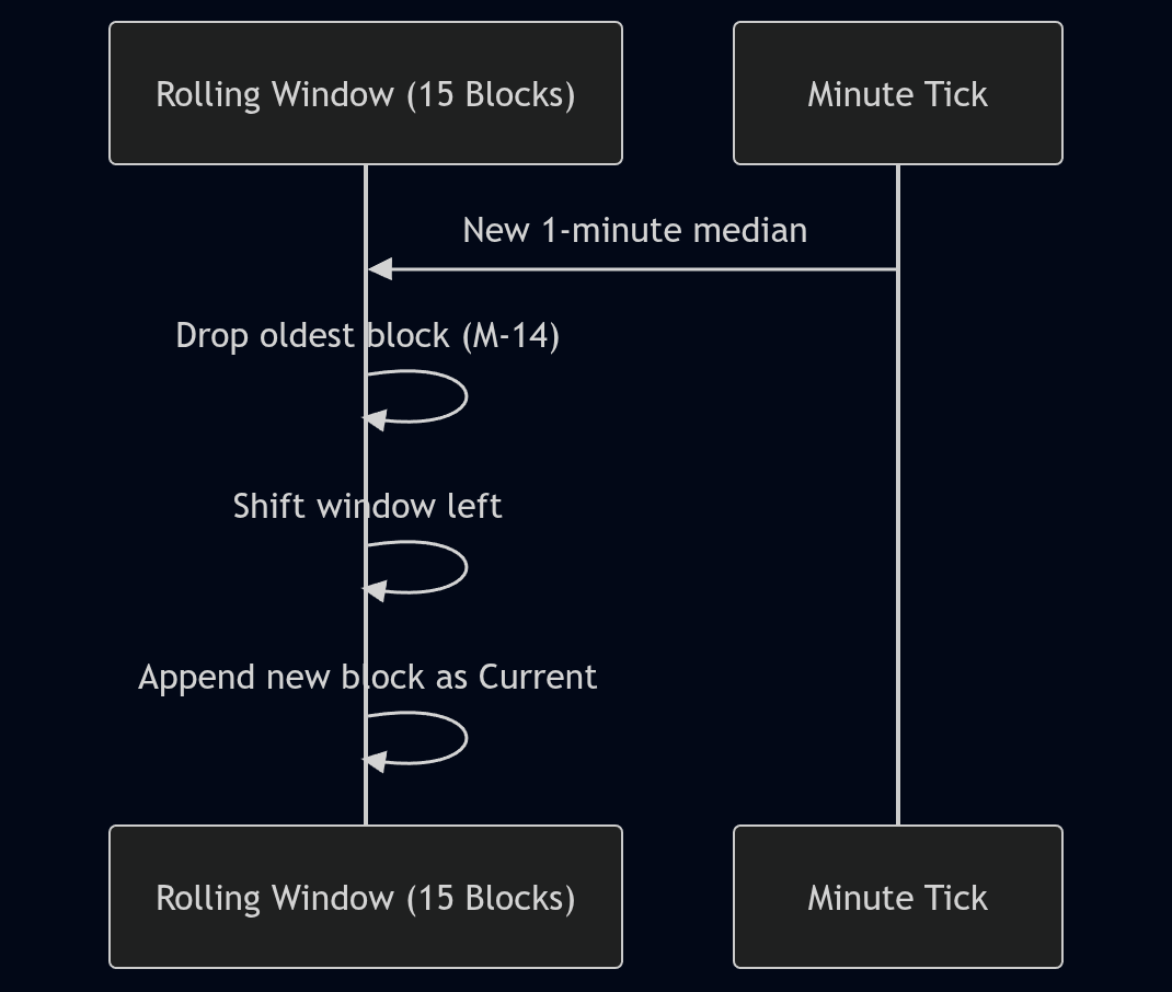
So, we came up with a fixed-size rolling heatmap window (internally, TemporalHeatmap). Live data accumulates
for 60 seconds (one per-second sample per metric). At the end of the 60-second period, it is summarized using
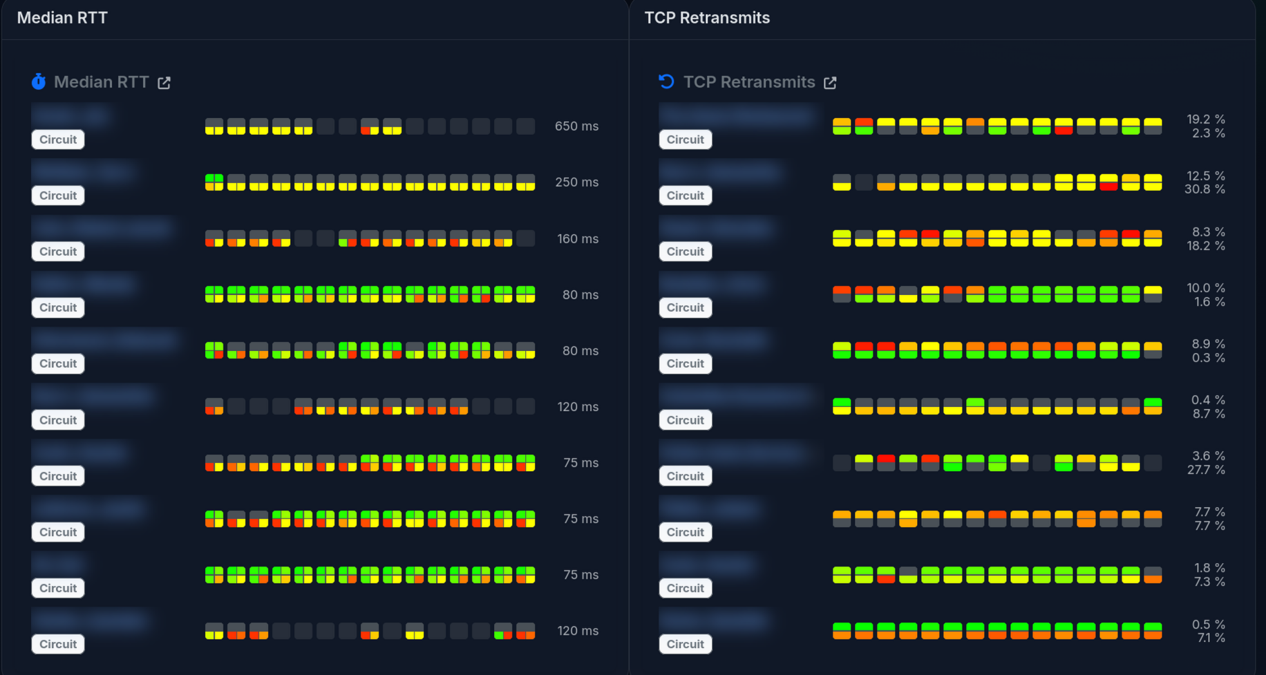
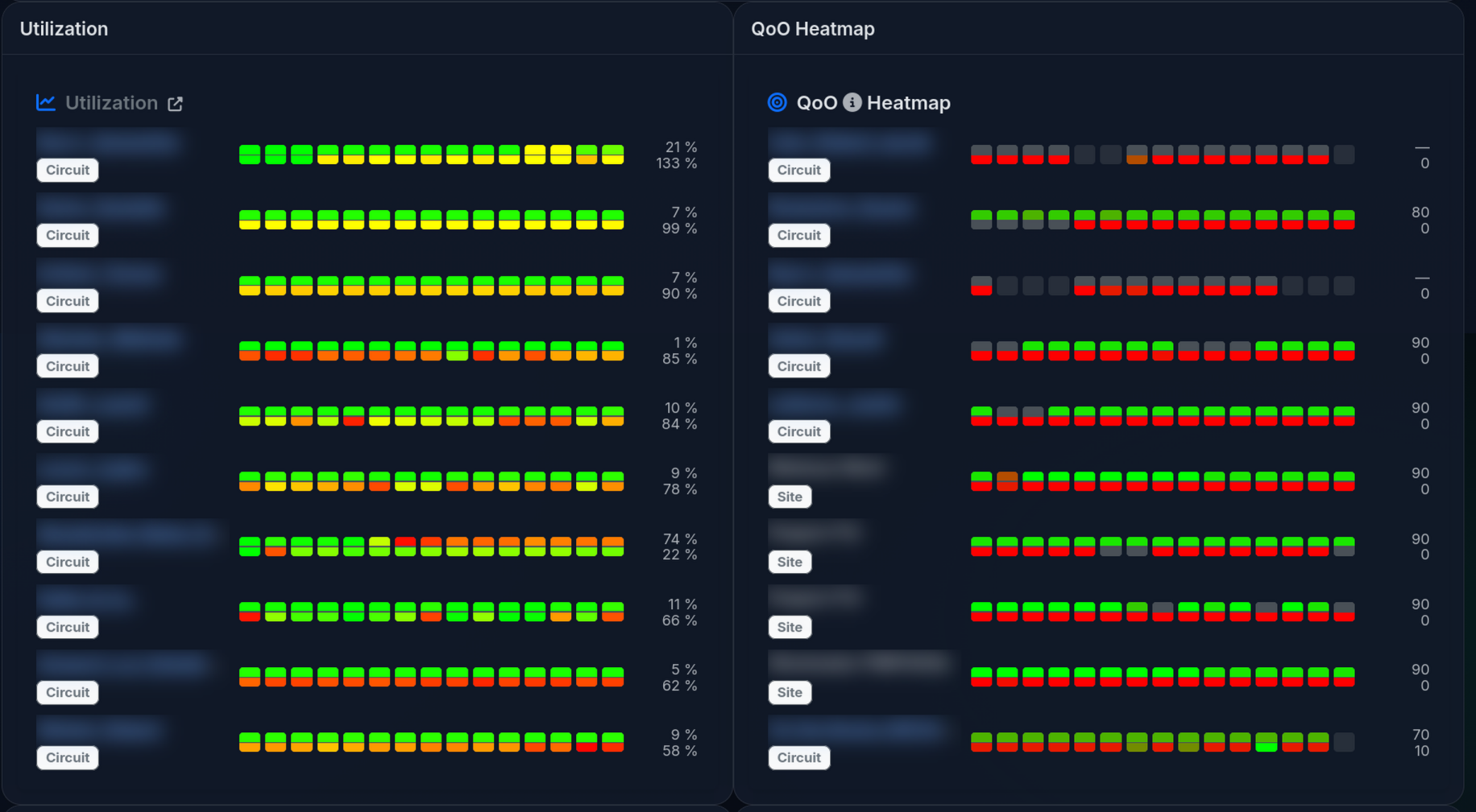
medians (not means/averages) and pushed into the per-minute history. The executive heatmap UI shows a 15-block
window:
- 14 completed 1-minute blocks (oldest → newest)
- 1 current “in-progress” minute (computed from whatever samples have arrived so far)
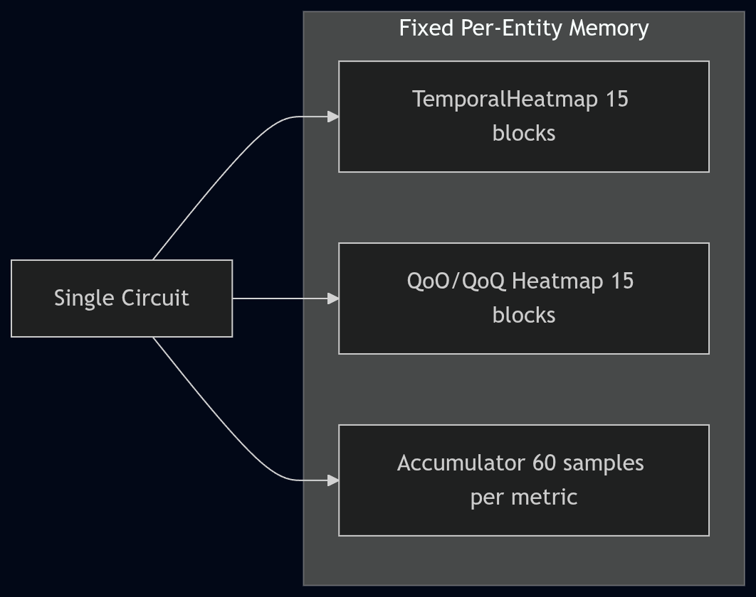
This is still a fixed amount of memory per tracked entity (circuit/site/ASN/global), but it’s not as tiny as an earlier back-of-the-envelope estimate suggested. The current implementation stores utilization, RTT (including p50/p90 by direction), and retransmit percentage in the heatmap, and it stores QoO/QoQ scores in a separate 15-minute heatmap. In practice, this tends to land in the “a few KB per circuit” range for heatmaps, plus hash map overhead (so 20,000 circuits is on the order of hundreds of MB once fully populated).
What Data to Collect?
We wanted to focus on what LibreQoS collects the best:
- Throughput (per host, and summarized across network trees in hierarchical networks)
- TCP Round-Trip Time - a good proxy for user experience.
- TCP Retransmits - which tend to spike when there are network issues.
Modeling Throughput
Presenting throughput on a “good to bad” scale is easy. You can take throughput / capacity and have an instant measure
of how utilized the circuit is. Fully utilizing capacity isn’t necessarily a problem - fully utilizing it for long periods
can be (an indication that an upgrade is a good idea).
Therefore, the throughput colors are based on the median utilization over the bucket. A connection that is continuously saturated will tend towards red.
Modeling Round-Trip Time
Round-Trip Time is a trickier one. In the current build, we’re using similar metrics to other QoE products. 0-100 ms is broadly good, 100-150 ms is yellow, and worse than that starts to go red. This is based on responsiveness research. Some parts of the UI also use a smooth green→orange→red ramp with a soft cap (currently 200 ms) for heatmap coloring.
RTT also isn’t “one size fits all”. LibreQoS now supports QoO profiles (configured in qoo_profiles.json) so you can
define what “good” and “bad” look like for your region/network, and the QoO score reflects that selection.
Rather than storing large numbers of floats in large buffers, we bucket RTT in a non-linear histogram (more resolution at the low end). Sometimes there are hundreds or thousands of readings per second, so keeping them individually isn’t practical.
Once again, we can summarize RTT into per-minute blocks to give a good feel for performance. However, a “mean” average isn’t a good measure. A few large spikes in an otherwise healthy connection will make mean averages look terrible. Instead, we summarize using medians. The executive heatmap includes p50 and p90 (by direction) so you can see both the typical and “tail latency” behavior.
TCP Retransmits
TCP Retransmits are a tricky one. Some are inevitable, and LibreQoS (via CAKE and fq_codel) can even induce some as part of the effort to bring packets to a reasonable rate. So the presence of retransmits doesn’t mean “danger” - but large numbers are a strong indicator that something is wrong. Therefore, we use a soft scale of green for a few percent, up to red for higher percentages.
We summarize these across time buckets using medians. Spikes in retransmits can be healthy (CAKE kicking in, network stabilizing). Sustained retransmits are frequently indicative of trouble, and median-based per-minute summaries help smooth out transient spikes.
Quality of Outcome
Quality of Outcome is a draft IETF proposal. Read the draft here
We decided to implement a Quality-of-Outcome measurement (QoO). In a passive “middle of the network” deployment it’s hard to measure true end-to-end packet loss directly, so LibreQoS uses TCP retransmit fraction as a loss proxy (with an explicit confidence value). QoO scoring is based on the IETF IPPM QoO draft’s approach (latency + loss), and what counts as “good” vs “bad” comes from the selected QoO profile.
Due to the RTT histogram bucketing, we can compute reliable RTT percentiles (including p50 and p90) at each level of the hierarchy, and the executive dashboard can display both the raw heatmaps and the derived QoO score heatmaps.
Display
We decided to display the global network-wide statistics as a simple heatmap. Easy to read - green is good, other colors not so good!
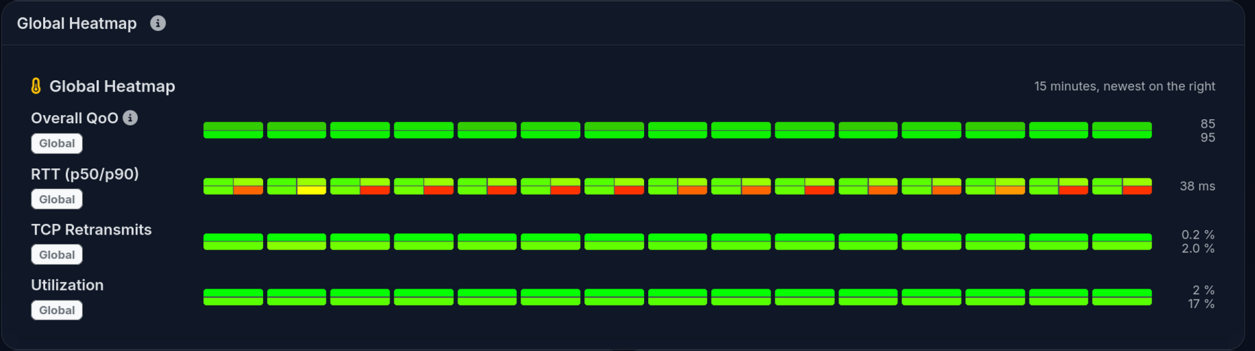
We followed a similar format for the round-trip time, and retransmits. We decided to focus on the worst scores, so you can immediately see what needs improvement.
Utilization and Quality of Outcome follow a similar pattern.
Overall, we’re excited that this is the easiest to use LibreQoS display so far! Let us know what you think.