LibreQoS Insight - Training Mode
• Herbert WolversonOne thing we’ve heard from people is that Insight looks great, but they ask, “How do I use this thing?” and, more importantly, “How does this help me?” We use Insight daily; it’s become our one-stop shop for finding network issues and understanding what’s going on. However, we’re all developers and have decades of experience as internet service providers. So we set out to demystify the experience.
Introducing the Training Site
So we’re happy to announce the launch of the LibreQoS Insight Training System. This site can walk you through most of what Insight reveals (in multiple languages).
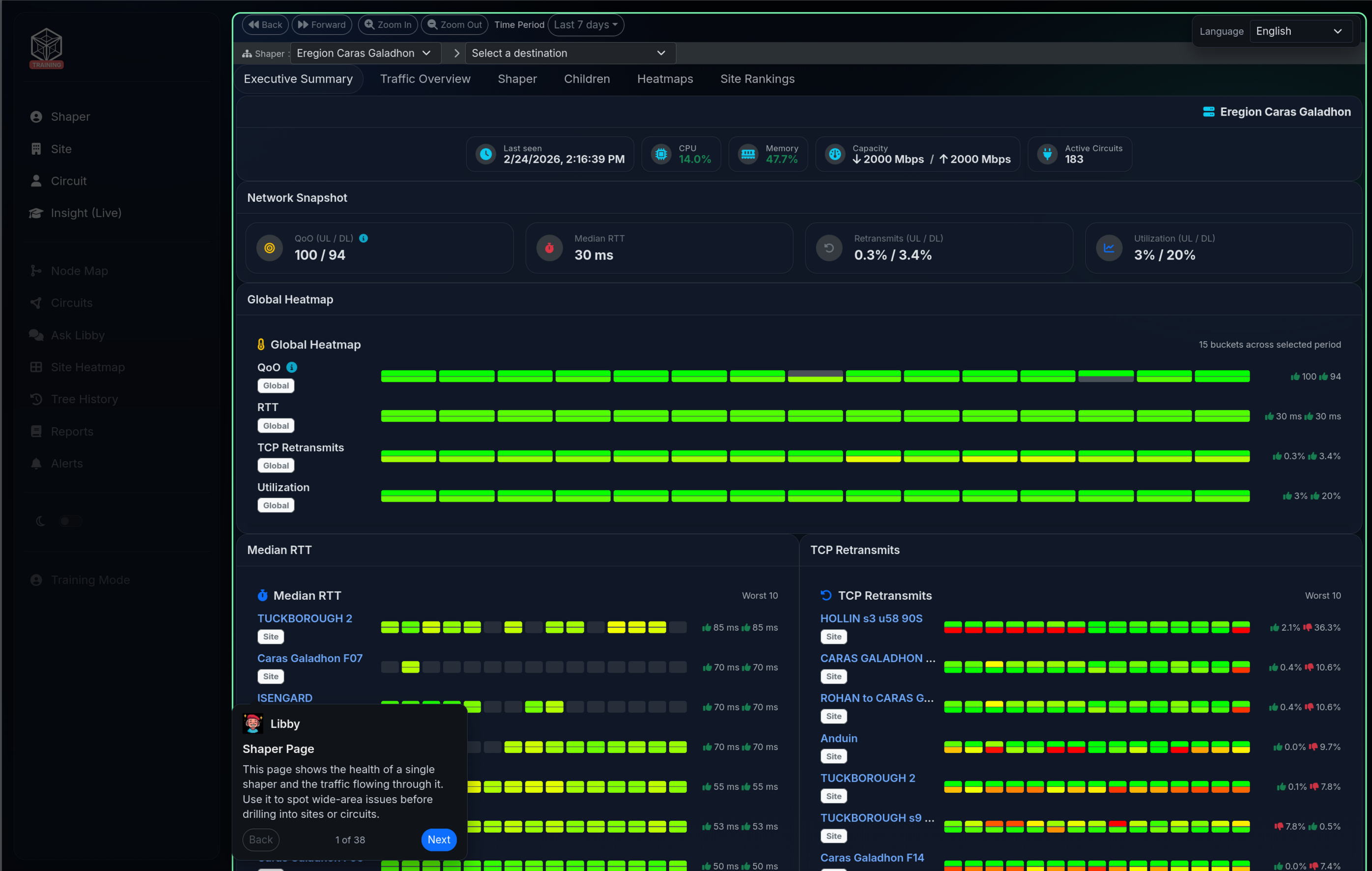
The training site covers the 3 main pages people visit regularly:
- The Shaper page (one per shaper; we support as many as you want to use).
- The Site page.
- The Circuit page.
You can click on UI elements for an explanation from Libby, or you can click “Next” and take the full tour.
How Does It Work?
Since this is a development blog, and not an advert, you’re probably hoping for some technical details as to how this was put together.
We started by adding a feature to the relevant pages to capture a snapshot of the data used to render the dashboard items. Under the hood, Insight runs a tight publish/subscribe system (data gets published, and interested components subscribe to receive it). Dashboard entries (“dashlets” - the little widgets on the page) subscribe to data feeds and receive updates on a regular cadence (in a compact binary format via WebSockets, an always-on connection between your browser and the server). Since every dashlet has the data it needs to render itself, it also has the data it would need to be rendered in a training system!
So we captured data for all 3 pages. Of course, now it’s full of customer information that we don’t want to be sharing. So the next trick was the creation of an anonymizer (a tool that strips out or replaces private customer details). We could simply replace text, but we wanted consistency. The name “Josephine Bloggs” should be the same everywhere it appears. We started by:
- Downloading a dictionary of place names found in the writings of J.R.R. Tolkien.
- Downloading a dictionary of person names from his books.
Then we created a Python script that maps each name to an entry from the books (site names get place names, circuit names get person names). It builds a stable dictionary (a consistent mapping) and uses it to convert all three pages at once, ensuring anonymity, readable names, and stability so we aren’t suddenly referring to the same entity under different names.
Then came the “easy” part. The dashboard is already made up of JavaScript classes and understands “messages”. So we mocked the dashboard for each page (built a local “pretend” version), and replaced the data ingestion path (where live data normally arrives) with one that reads the data from the captured/sanitized data feeds.
Finally, we built a large dictionary of explanations (for the site, navigation, and each dashboard entry) and translated it into Spanish.
This answers the “WHAT am I looking at?” question! We included some context on why each section might help.
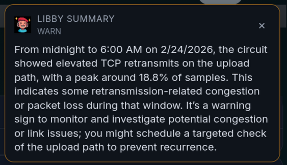
Introducing Libby
A second part of making Insight more useful is reducing the user’s cognitive load (how much your brain has to keep track of at once). We hit you with a lot of data up front. We try to make it easier with color-coding (red is bad!) and even implemented a colorblind-friendly mode. But that still requires that you scroll around, click through tabs, and build a mental model for what’s happening.
Out of curiosity, I took a screenshot, sent it to an AI, and received a pretty helpful set of suggestions for things to look at. That’s great, but we also don’t want to make you install Claude CoWork or similar to understand our system!
We already have some AI integration:
- You can “ask Libby” and discuss your network.
- The trouble ticket workflow will iteratively gather information related to a trouble ticket (a customer-reported issue) and advise you.
So it made sense to add some summary information to your Insight pages. We also realized that this presented a golden opportunity: we could check your browser’s language preference and offer any explanation in your preferred language.
We’re also careful to use non-data-collecting sources!
Now, when you open a shaper, site, or circuit page, you’ll see a short pop-up (designed to be easily dismissed or ignored):
So How Does This Work?
A naive approach would be to upload a screenshot of the dashboard and see what happens. That actually works with large vision models, but it’s not at all ideal. We’d have to render the whole thing, base64-encode it (turn it into plain text), upload it, and burn a bunch of tokens (which usually means more time and more money).
Instead, we extended the Dashlet type (the base class for those dashboard widgets) to include an explain() function, with a default implementation that returns null. Then, for every dashlet (or at least most of them), we iterate through the render data and emit structured output (machine-readable facts, not prose) describing anything that might be wrong, along with a severity (how bad it is). Running out of memory, CPU running away, capacity full? These get summarized. Finally, we ask an LLM (Large Language Model - a text-generating AI) to take the structured summary and output a short piece of guidance for the user.
We hope you enjoy these features! It’s an exciting (and scary) time, with large language model development charging ahead. Features I used to think were science fiction are commonplace now. We don’t believe in delegating everything to AI, but if it can help with your cognitive load, that’s a good use case for it.